Mei Liang Watercolor Lightfast Test
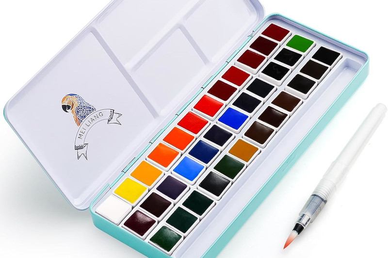
Monday, November 13, 2023Nearly eight months ago, I started a lightfastness test for a set of jelly gouache, a set of watercolor markers, and three watercolor paint palettes, including this Mei Liang "Pretty Excellent" set of 36. I made wide swatch cards with each color, then cut them in half lengthwise so that I had each color on two strips from the same swatch. The control side went into a drawer for later comparison.
Background:
I got my Mei Liang set of 36 watercolors in January of 2022. This was back when the paints were seated in blister-type packaging. Since then, the company has changed the packaging so that artists can easily reorder the paints. I am not sure if they changed the formula of any of the paints when they changed the packaging, so that may be worth looking into if you are considering buying a set of these.
Paper Used:
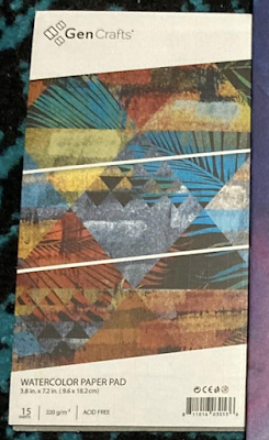
For this test, I used the little pad of paper that came with my GenCrafts 24 Metallic watercolor palette. That proved to be problematic, as the paper in the window turned brown with light exposure. This made it difficult for me to tell if some paint colors shifted and faded or if it was the paper causing them to look different. When I do lightfast tests in the future, I will use my other GenCrafts paper (which was fine for all of my other tests) or Canson XL watercolor paper to avoid this issue.
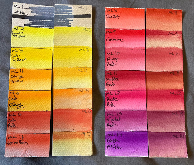
Mei Liang "Pretty Excellent" Watercolor Swatches Before:
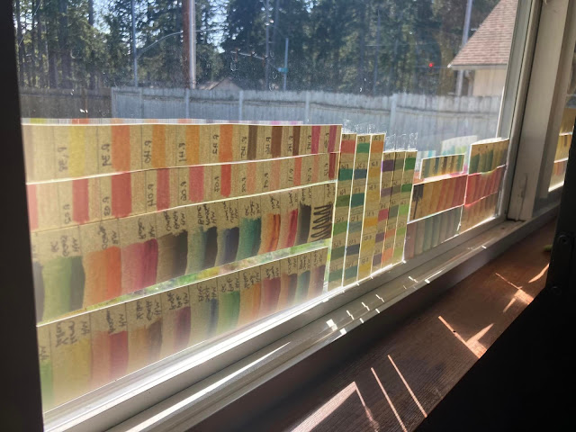
The strips went up in a double-paned vinyl south-facing window from March 21st to October 25th of this year (about 7 months). Near the equinoxes, these strips got full sun exposure, but at the height of summer, the eaves on the roof left them with only indirect light. This is enough to show fading in the most unstable pigments, though a longer test might have been better to test some of the paints.
I eventually took all of my test strips down because I noticed some condensation on the window in the mornings after I rearranged my room to put the bed closer to the window. This affected two of the six strips involved in this test, perhaps enough to invalidate them entirely.
Hypothesis:
I started this lightfast test after looking at Kimberly Crick's test of this palette, so I expected minor fading from crimson lake deep, purple lake, verditer blue, cerulean blue, and hooker's green light. I expected major fading from yellow orange, cadmium orange hue, vermillion, scarlet lake, crimson lake, alizarin crimson, mauve, dioxazine violet, turkey blue, yellow green, sap green, and olive green. Because my test didn't go as long, I might be less likely to notice some of the colors fading or shifting.
Results:
Note that my color names are not necessarily the same as Kimberly's. For instance, the color I have labeled "fresh purple" is the color she calls mauve. I think this is because of conflicting color names in the palette packaging where the swatch sheet said one thing and the back of the package said something else, but it is also possible that the company changed the color names or formulations. I numbered the colors in reading order looking down at the open palette, so I can count down the columns on Kim's test page to compare.
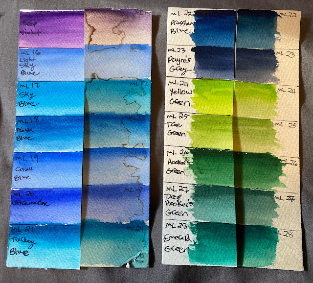 |
| The strip with colors 15-21 had water damage from condensation in addition to the paper turning brown from sun exposure, so it is especially difficult to say which colors faded. |
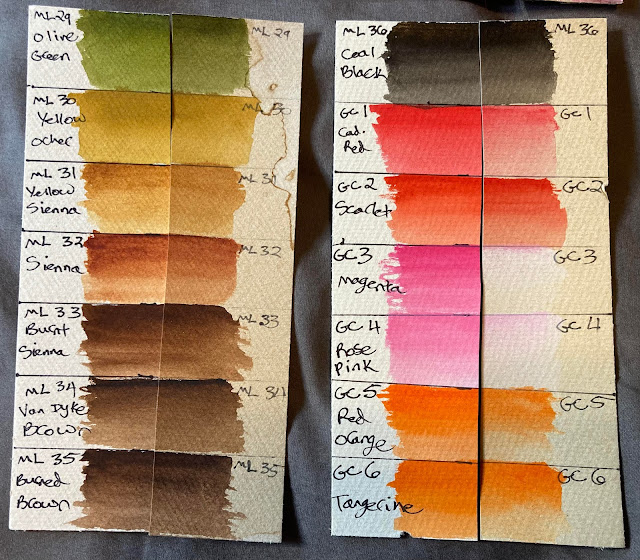
My results came out less scientific than I wanted because of the water damage and condensation issues. I noticed major fading on the vermillion (7), carmine (9), madder red (11), and fresh purple (14). I noticed more subtle fading in lemon yellow (2), orange yellow (4), cadmium orange (5), scarlet (8), violet red (13), and deep violet (15). There also seemed to be a color shift in cadmium orange (5), rose red (12), sky blue (17), Prussian blue (22), Payne's grey (23), yellow green (24), tree green (25), deep hooker's green (27), and olive green (29). It's difficult to say, however, if all of the minor fading and color shifts are from the paint itself, or if the browning paper and water damage are contributing issues.
Overall, my results seem pretty consistent with Kimberly Crick's, if a bit less fading because of the shorter test time. In any area where my opinion deviates from hers, I'm inclined to say that her test was more likely to be correct anyway. I don't plan to repeat the lightfast test on this palette because I have already given away ten of the colors in a palette restructure.
Takeaways:
The biggest lesson I learned from this test was to use a tried-and-true paper for my lightfastness tests. The browning paper and condensation on my window causing issues made this test a little frustrating, but since Kimberly Crick already did such a good job testing this particular palette, that's not a huge loss to the information bank of the Internet.
Since I already had a pretty good idea which paints were the most fugitive from this set before I even began the test, I took those out of my paint palette and passed them on to a budding young artist who just wanted some paints to play around with that were higher quality than chalky craft paints or Crayola ones.
I also have a Paul Reuben's watercolor set, which is the artist grade line from the same company and its colors tend to be more colorfast, so if I begin a painting with the intent to gift it, I would probably use those, but it wouldn't be the end of the world if I discover partway through a painting that I want to give it away.
Since I've already gotten rid of the most fugitive paints in this set, I would be comfortable spraying the painting with a UV protective coating or putting it under a UV light filtering glass to protect it before giving it to the recipient. The bigger issue I might run into is fugitive paints in the GenCrafts set that I mixed these paints with to make my mega-palette of student-grade paints because some of those are also fugitive, but that lightfast test will be the subject of my next post.




0 comments