Himi Mia Jelly Gouache Lightfast Test
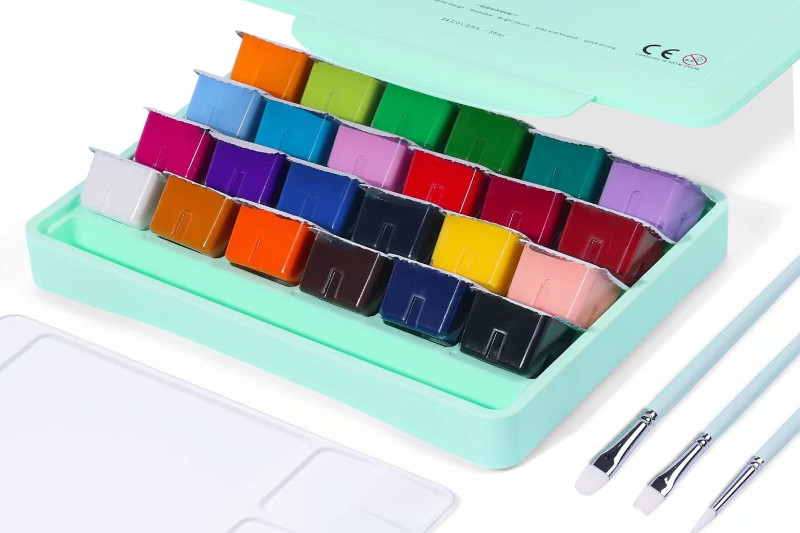
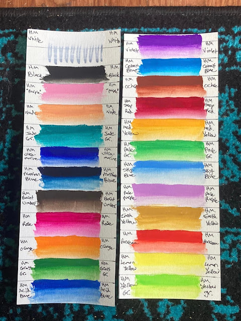
Monday, November 13, 2023Nearly eight months ago, I started a lightfastness test for three watercolor palettes, a set of watercolor markers, and this set of 24 Himi Mia Jelly Gouache. I made wide swatch cards with each color, then cut them in half lengthwise so that I had each color on two strips from the same swatch. The control side went into a drawer for later comparison.
Paper Used:
 |
| GenCrafts 140lb wood pulp watercolor paper. |
Himi Mia Jelly Gouache Swatches Before:
Conditions:
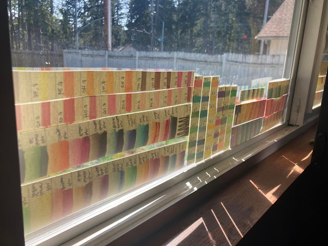
The strips went up in a double-paned vinyl south-facing window from March 21st to October 25th of this year (about 7 months). Near the equinoxes, these strips got full sun exposure, but at the height of summer, the eaves on the roof left them with only indirect light. This is enough to show fading in the most unstable pigments, though a longer test might have been better to test some of the paints.
I eventually took all of my test strips down because I noticed some condensation on the window in the mornings after I rearranged my room to put the bed closer to the window. That may have messed with some of the results from other paints, but the strips for the jelly gouache did not seem to be affected.
Hypothesis:
These are craft-grade or student-grade paints, so I expected that some of the colors would fade and some would not. I expected that colors would fade more when applied in a light wash like watercolor than thickly in mass tone, especially because gouache is more opaque than watercolor. I had not seen any other lightfast tests online for these paints when I went looking, so I didn't have any specific colors to watch out for based on that. Bright purples and pinks are often fugitive (because of dye-based pigments) while earth tones tend to be inexpensively made with more stable pigments, so it would not surprise me if the purples and pinks faded the most and earth tones were most stable.
Results:
Takeaways:
I don't often use gouache, but when I do, it's usually to save a watercolor piece where my colors got muddy from painting things in an incorrect order or not waiting for things to dry properly before continuing. For example, it helped me to save this sunflower painting where the green was badly bleeding into the sunflowers. The opacity of gouache makes it useful for this kind of art rescue mission.
Since I so rarely use gouache, this lightfast test isn't going to change much about my creative process. I don't feel like I need to run out and buy a more lightfast professional-grade set. If I were to make a gouache piece with the intent to give it as a gift, however, I think I would avoid the "purple" (pink), nude, grass green, violet, and pale purple. I would also make sure to use a UV protective coating or frame it under UV protective glass before giving it to the recipient. For the money, I still think these are a good value and I would recommend them to anyone casually interested in gouache.


0 comments